

Pixiv: https://www.pixiv.net/users/9752301
Twitter: https://twitter.com/ChickeIII
Fanbox: https://chickeiii.fanbox.cc
Purchase:
Melonbooks (JP, censored): https://www.melonbooks.co.jp/detail/detail.php?product_id=2700571
MyACG (CN, uncensored): https://www.myacg.com.tw/goods_detail.php?gid=5411591
It’s been a slick two years since I last used this blog. Moving on.
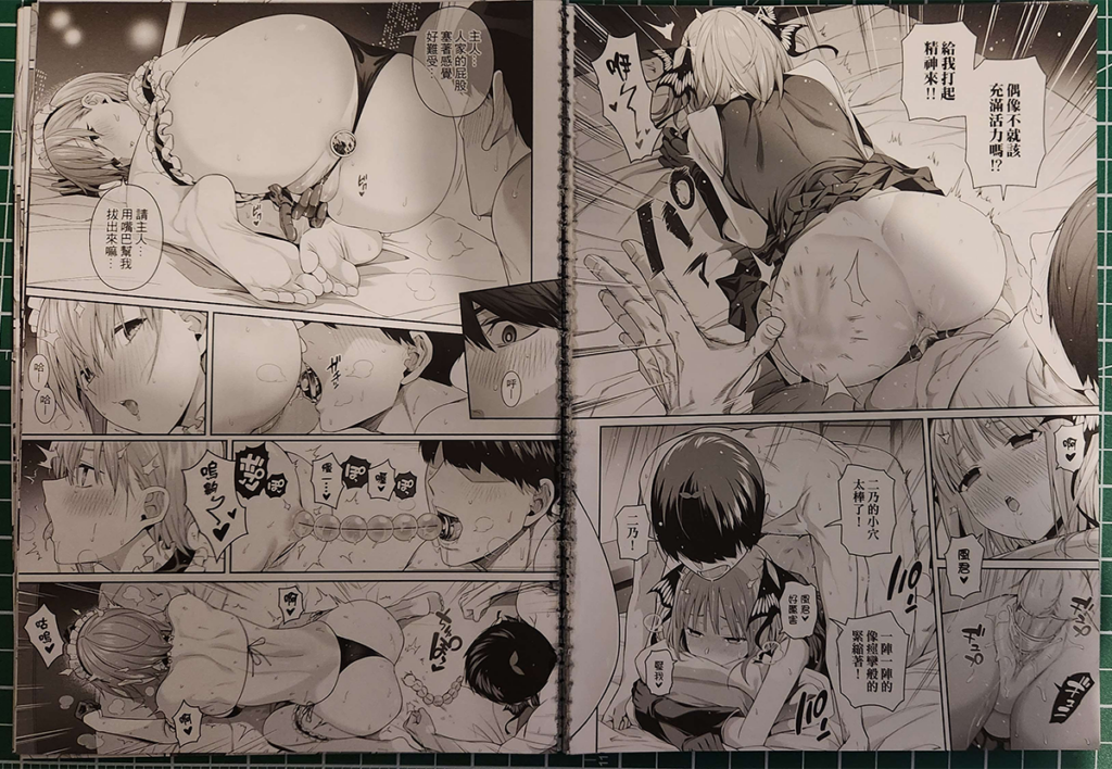
This blogpost isn’t for a translation, but just a scan of Bad Mushrooms’ FF44 release of their Gotoubun no Hanayome doujin. You can read the excellent English translation done by Fap It Scans here.
I wanted to go over some of the thoughts I had while scanning this book, along with my grievances with my shortcomings when processing the scans. I put out a call for help in the uploader comment of the gallery hoping that someone might come along and tell me how better to scan this type of print because I really want this scan to look as good as possible, to the point that I’m willing to reprocess the whole goddamn thing if need be.
Differences between the digital and print versions
The blue rectangle shows the size of the page in print versions. As you can see, the print version crops out about 4 mm on all sides. It’s not that big of a deal for the most part. Edges usually don’t have much in the way of important detail (although I have seen books where text has been cropped out by the print cut), and the extra space has given me some wiggle room when it comes to fixing edges that were marred by glue residue and notches (copy-pasting the digital version on top of the affected areas, and then using a gradient mask to blend the two parts together). Also, this difference in art cropping is the same with the JP version.
The Cover
There’s no major difference between the JP and CN covers, other than the title.
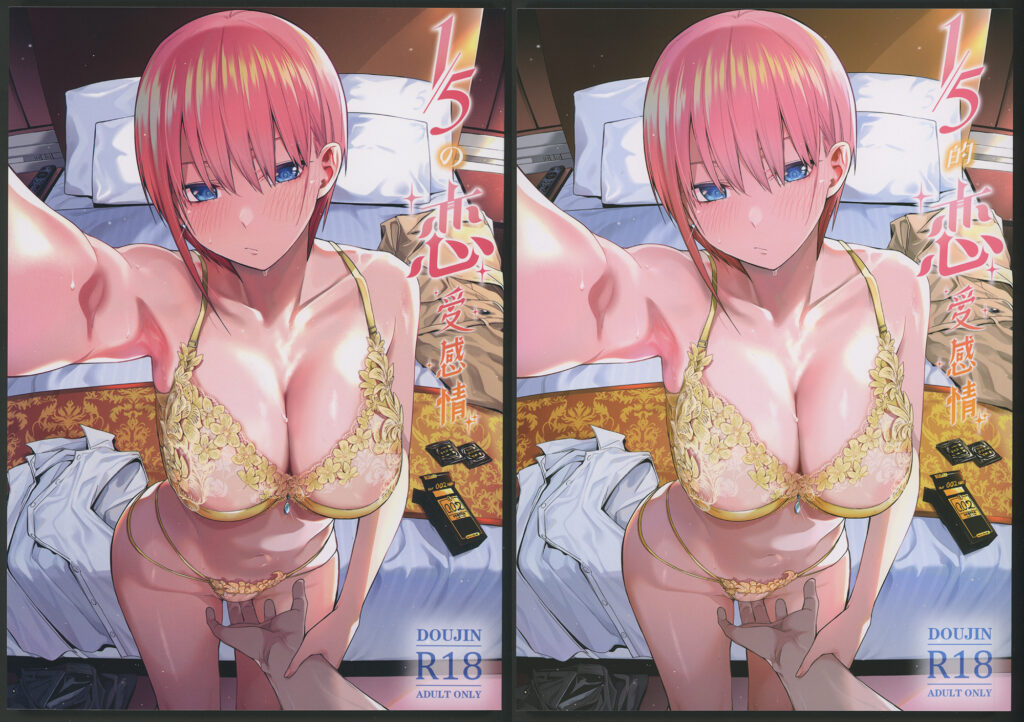
Although, from a glance, you can probably tell that there is a slight difference in colour between the two. I can’t really tell if this was caused by a difference in paper used, a difference in ink used, or if Bad Mushrooms adjusted the colours between sending the files to the printing companies.
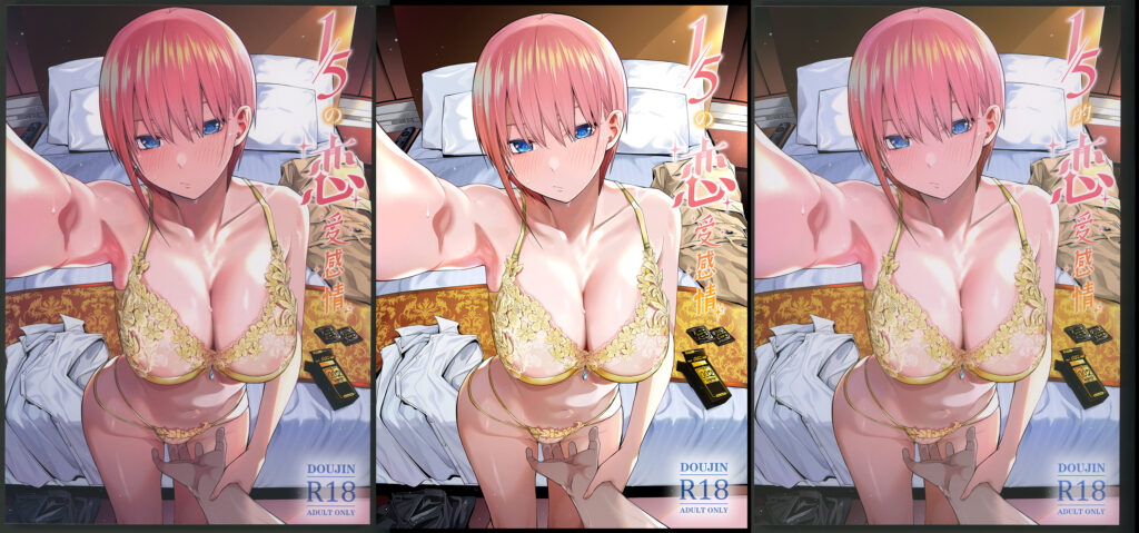
And here’s the digital cover. You can see the difference in crop size here too.
I think this is a very good representation of the fact that there will always be a difference in colours, shading, and image quality between scans and digitals, because scans have to contend with the colour and quality of paper and ink, and whatever extra distortions may be introduced by the scanning process.
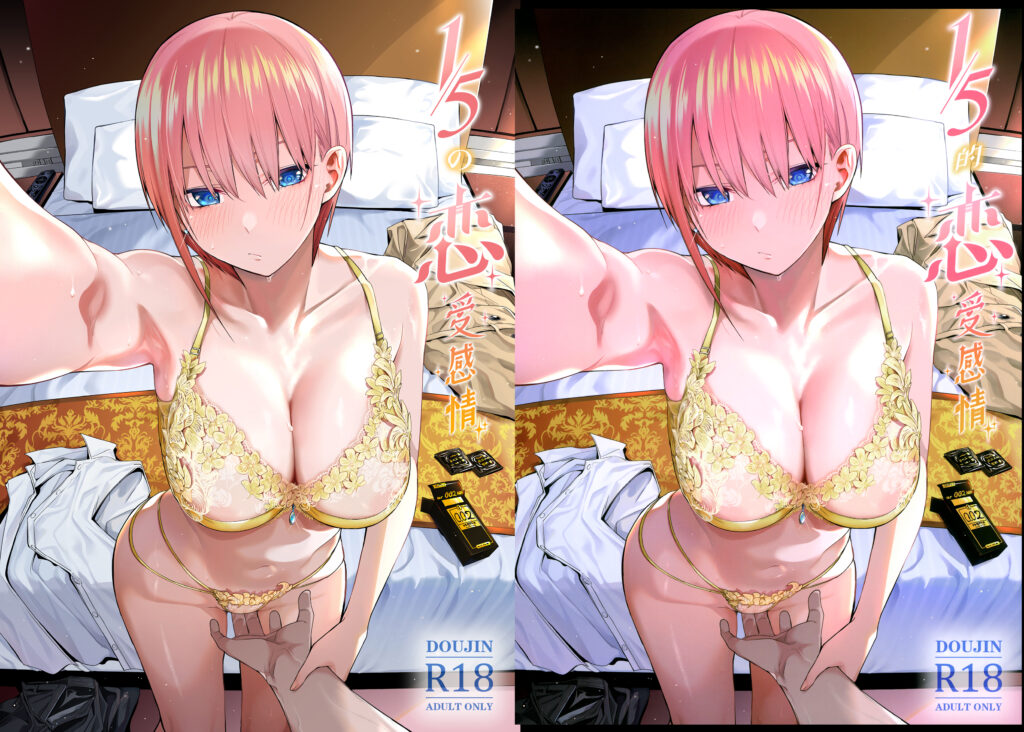
I tried doing a bit of colour correction with my cover scan, but when put side-by-side with the digital cover, it’s obvious that it’s not a perfect match. Honestly, I could’ve done a better job at matching the colours, but I don’t think it’s that big of a deal, especially since anyone who wants to scanlate off of the decensored version can just use the digital covers (there’s no censored art).
Lastly, I want to draw your attention to something I’ve only seen on the books I ordered from Taiwan.
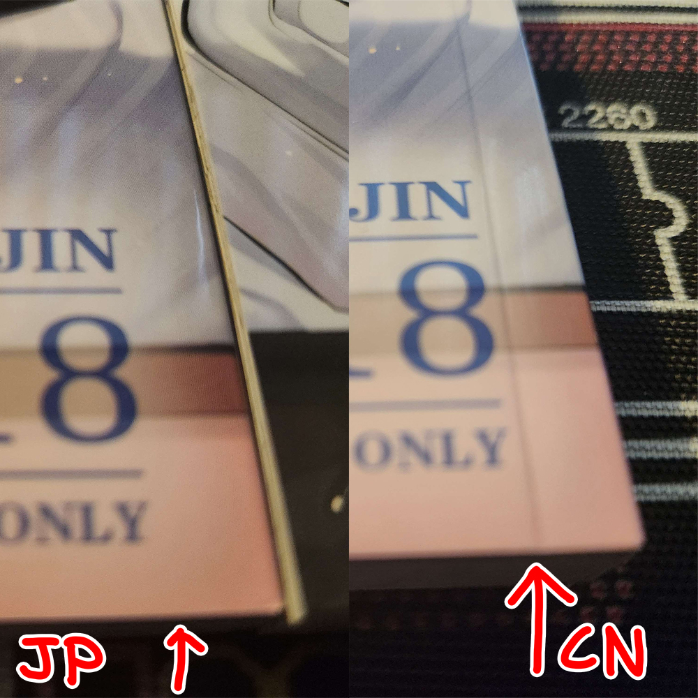
I call it a cover gutter because I don’t know what it’s actually called. It’s a thin depression running along the length of the book. When you open the book, the covers fold along that line. It’s on both the front and back covers, and if you zoom in close enough on my scans, you might be able to see them. For the most part, I don’t bother with removing them because it’s a lot of work and in this book’s case, you can take the digital covers for scanlations anyway. I just think it’s neat, and it’s interesting how I’ve only seen this on my TW books.
The Card
Like I wrote in the very last image of the scan gallery, the CN version comes with a customized playing card tucked into the book.
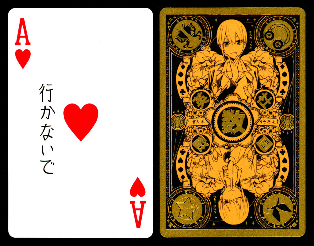
I think it’s really cute, especially as part of the whole package. Some part of me wonders if Bad Mushrooms will do four more cards, one for each sister. One of them will have to be something other than an Ace, though. Maybe Joker for Yotsuba.
Anyways, scanning the back of the card was a bit of an ordeal. It has a gold foil texture, and trying to scan reflective surfaces with a normal scanner will result in an overexposed mess.
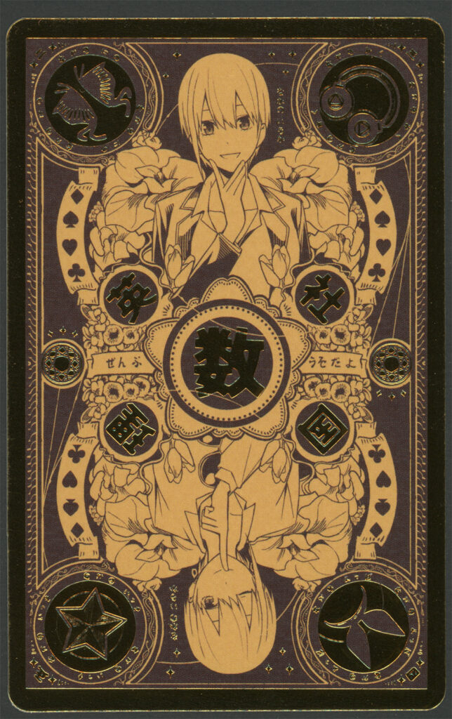
All the reflective gold bits turn near-black, and it doesn’t look anywhere as cool. You might not even realize it’s supposed to be gold foil.
Fortunately, I came prepared. The solution is to use thin diffusion paper to scatter the light so the scanner can actually see the shiny reflective effect of the foil texture. After that, it’s just a simple matter of using levels to make the colours pop out.
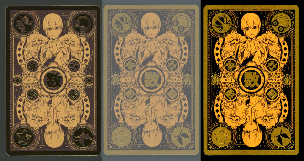
This technique is great for any reflective surface, like books with fancy covers.
The Goddamn Paper Grain and Gradients

Look at that sweet, sweet night sky. Near-black, dotted by a few stray stars that could penetrate the city’s light pollution, and the reflection of the room’s own dim lighting. Even despite the banding, the slow gradient from dark grey to light grey as it goes from the sky to the city is graceful.
Jesus Christ.
Yeah, this is just one of those things you can’t avoid when scanning physical media. No matter how clean of a scanning surface you have, no matter how dust-free your scanning environment is, you will never be able to control the physical quality of the pages. Paper grain and weird ink splotches have conspired against me to ruin any part of the book with lots of dark colours.
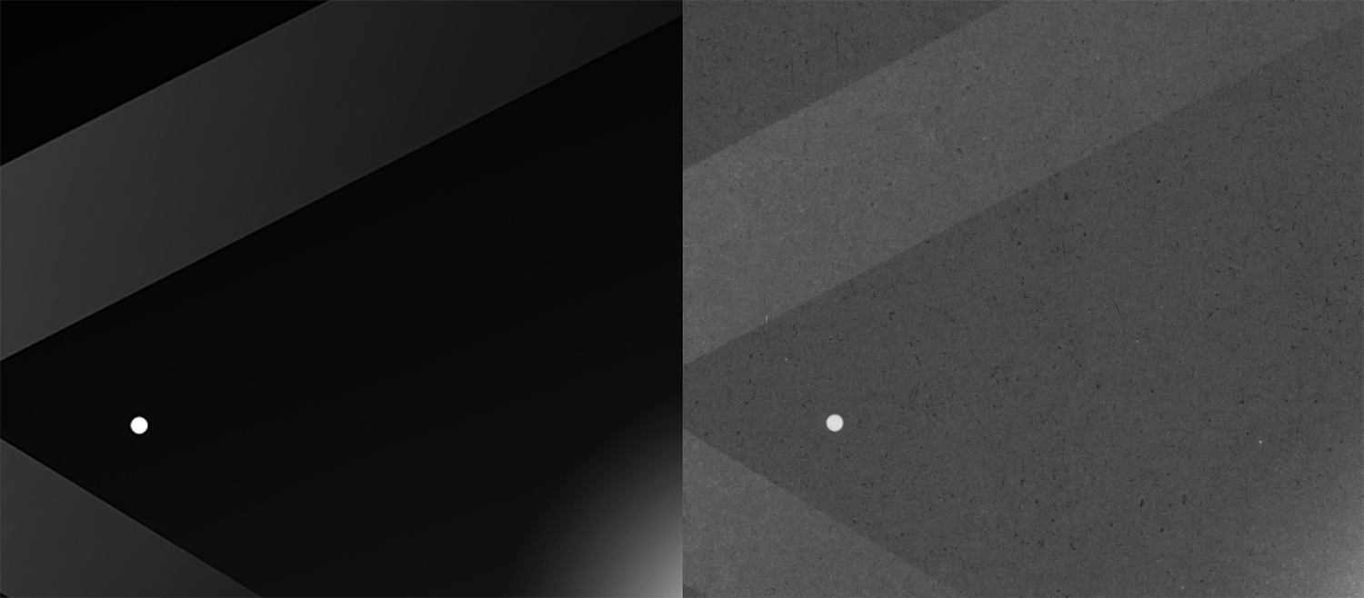
Look at those dark splotches of ink. What is that? Inconsistencies in the paper density, causing more ink to get absorbed into the page and creating a dark spot? It looks awful! And the worst part is that none of the denoise algorithms me or Zorb tried could fix it up.
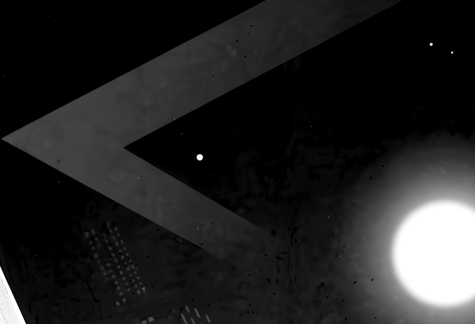
I’m genuinely unhappy with how it looks in the final export, but the only other option is to go over each and every page with the heal brush and manually zap every dot. Honestly? It’s not worth it. Working with solid gradient scans is rough enough, but having to deal with these random dark splots that get even worse after running the page through the denoise algorithm is hell. Please, if you know of an easier way to deal with these, let me know. Send me a message on the E-H forums or DM me on Discord via our server. I need to figure this out.
End
Kind of a desperate end to this blog post, huh? I don’t have much else to say. The uncensored art looks fantastic— ChickeIII’s knocked it out fo the park one again as usual. Shame about the scan quality, but to be honest, it’s mostly confined to parts of the book where there’s large dark areas. The parts of the book that are most interesting (the sex, the girls, and the uncensored art) are largely unaffected by these issues.
I guess I’ll cap it off with some funny things I noticed while scanning the book.
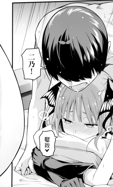
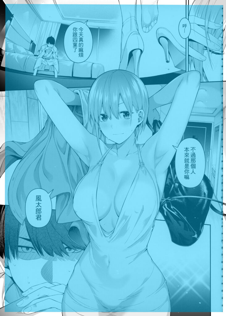
On page 73, there’s this big semi-oval that sticks into the panel. I’m not sure what it is. Might be a leg or an ass that was meant to be part of a 2-page spread, but the opposite page doesn’t have the rest of it. Guess ChickeIII scrapped the spread but forgot about this thing.
And that’s all I have to say! Please support the artists by purchasing their works and/or following them on social media!
Pixiv: https://www.pixiv.net/users/9752301
Twitter: https://twitter.com/ChickeIII
Fanbox: https://chickeiii.fanbox.cc
Purchase:
Melonbooks (JP, censored): https://www.melonbooks.co.jp/detail/detail.php?product_id=2700571
MyACG (CN, uncensored): https://www.myacg.com.tw/goods_detail.php?gid=5411591
Dlsite (JP, CN, censored, digital): https://www.dlsite.com/maniax/work/=/product_id/RJ01307093.html
Fanza DMM (JP, censored, digital): https://www.dmm.co.jp/dc/doujin/-/detail/=/cid=d_491036/